Friday, April 28, 2017

Interior Thinking

_______________________________________________________________________________________________________________________________________

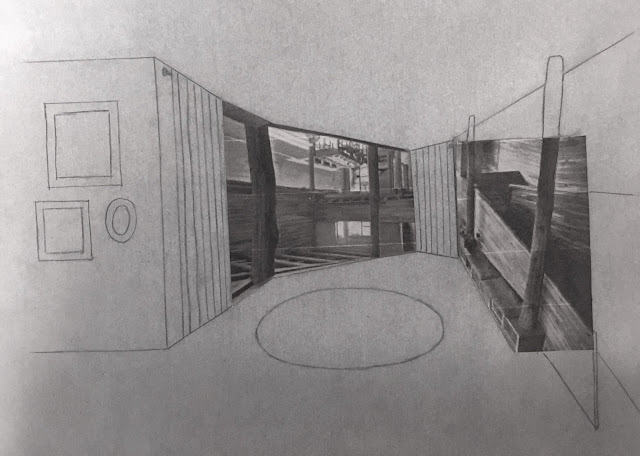
Once I created a shell for my building, I began considering interior spaces. The interior spaces were designed using parts of drawings to collage floor plans. The drawings used to collage were original sections and elevations of Maison Errazuriz. The abstract "plans" were translated into drawn plans and sections.


_______________________________________________________________________________________________________________________________________
The next step will be to further develop the site, which currently is a dried-up riverbed, and to consider access. After that I can develop the interiors more.


Wednesday, April 26, 2017

3-D Drawings in Design

Goals of My Project:

  • Use 3D drawings to design as well as to present
  • Flip-flop 
  • Experiment with solid/void relationships

____________________________________________________________________________________________________________________________________________

Idea One: Vertical House

Flip-Flops:
  • Put partly underground
  • Horizontal to vertical building orientation


_____________________________________________________________________________________________________________________________

Idea Two: Solid/Void Flip-Flop, Courtyard Version

Flip-Flops:
  • Solid/void flip-flop


_______________________________________________________________________________________________________________________________

Idea Three: Solid/Void Flip-Flop, Split Version

Flip-Flops:

  • Solid/void flip/flop
  • One building to two buildings


Saturday, April 22, 2017

Reflection on Crit Number 4


Reflection on the Crit:

  • Building is too large 
  • Didn't stick to perspectives
  • Building is boring/commercial
  • Why an aquarium?
  • If the windows were important, why were they not on the exterior?
_______________________________________________________________________________________________________________________________________


Reflection on the Project:

I greatly enjoyed this method of design with cutting out pieces of the pictures and perspectives and creating something from them. I found it interesting seeing how you could use rotation to make something really different. However, during the crit I realized that there were challenges to this method of design.

For one thing, perspectives are a difficult thing to measure, so there was a lot of variation from design to design with final building sizes, and some people's perspectives didn't seem to match with the size of their buildings. I had the problem that one out of three of my original created perspectives showed a huge space, so that part of my building became ginormous since I was staying true to my perspectives.

Also some people struggled with interpreting the directions about how our building was supposed to be inspired by the created perspectives. Some people had to change their 3 views drastically due to the abstract qualities of the originals. Others such as myself seemed to have made design changes for practical reasons. In the end it all came down to variation in the interpretation of the project directions.

It was very interesting seeing how many different programs were selected, and some of the selected programs were extremely creative. I felt like the fact that we were allowed to choose a program allowed us to enjoy the project more, but at the same time it created problems. While someone may look at a created perspective and see a restaurant, an aquarium, or a boat house, other people might see something entirely different and therefore not understand the choice. Especially because a lot of the original created perspectives were either vague or abstract, they really could have been a lot of different things.

Obstruction Four: This and That


Saturday, April 15, 2017

A Museum for Fish

The program of the building is now an aquarium. It is a fairly small aquarium, which floors of changing heights, varying aquarium sizes, and a guest area including a cafe. The single height floors are all ten feet tall, so double height spaces are twenty feet tall. The site will be in a city. Four different views were utilized. 

The following views are used:


___________________________________________________________________________________________________________________________________


Structurally, is it currently unsound and the program may actually have to be rearranged in order to support all of the tanks sufficiently. 

Tuesday, April 11, 2017

Building Onto Previous Ideas

Three Top Ideas:


The next step is to start considering:

  • program
  • sequences
  • environment
  • envelope
  • scale

Saturday, April 8, 2017

Complete the Image

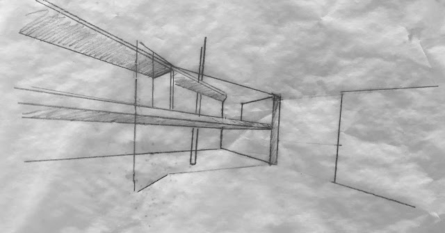
For our fourth project, we are using existing interior perspectives and images of our Le Corbusier house to create an entirely new structure. Certain parts of each image are selected and cut out. Images can be rotated. Then, we are to continue the images in any way we imagine. This is the design phase. We should be trying to make our spaces experiences. We should consider mood, emotion and warmth. Certain materials will be more or less helpful to make the space inviting or to give it a certain mood. The result can be any kind of building or room we please.
___________________________________________________________________________________________________________________________________

The following designs were created for homework:


______________________________________________________________________________________________________________________________________

In class we did a design charrette in which we used other people's projects and attempted to give them some new ideas:
These were some of my ideas for Rachel:


_______________________________________________________________________________________________________________________________________

And these were some of Hoss's ideas for me:


Wednesday, April 5, 2017

Obstruction Three: Exquisite Corpse


Reflection on the Crit:

  • Why add color to the sky, fountains, and cobblestones?
  • Create a more convenient entrance
  • Site plan does not read well - hatching is distracting

_______________________________________________________________________________________________________________________________________


Reflection on the Project:

The project gave me yet another new way to come up with design ideas: by collage. My favorite kind of collage that I did was the perspectives. I feel that I may continue to use the collage method for design in the future. It was interesting designing the building before choosing a site, and it created a few challenges.